The Barnes Foundation
I first visited the Barnes Foundation in its original site in Marion, Pennsylvania, in the 1960s. I was an art student joined by several colleagues as anxious as I was to see the collection. I recall Cézanne’s Card Players, and works by Degas, Matisse, Modigliani, van Gogh, Picasso, and Soutine. At the time, most of the objects, other than the paintings, I regarded as a distraction. The setting was not like any other gallery or museum I had seen. It was a new experience, hovering somewhere between seeing art in a museum, gallery, or alternate space and seeing art in a domestic space. The Barnes was different.
The art collector, Albert C. Barnes (1872–1951) chartered the Barnes in 1922 to teach people how to look at art. Dr. Barnes collected outstanding examples of impressionist, post-impressionist, and modern paintings, medieval art, Greek antiquities, African masks, native American jewelry, antique hinges, tools, and decorative metalworks.
I now realize that in the 1960s I did not see what Dr. Barnes intended. I was looking at the paintings, and I missed seeing what Dr. Barnes meant when he said the purpose of his foundation was progressive education.
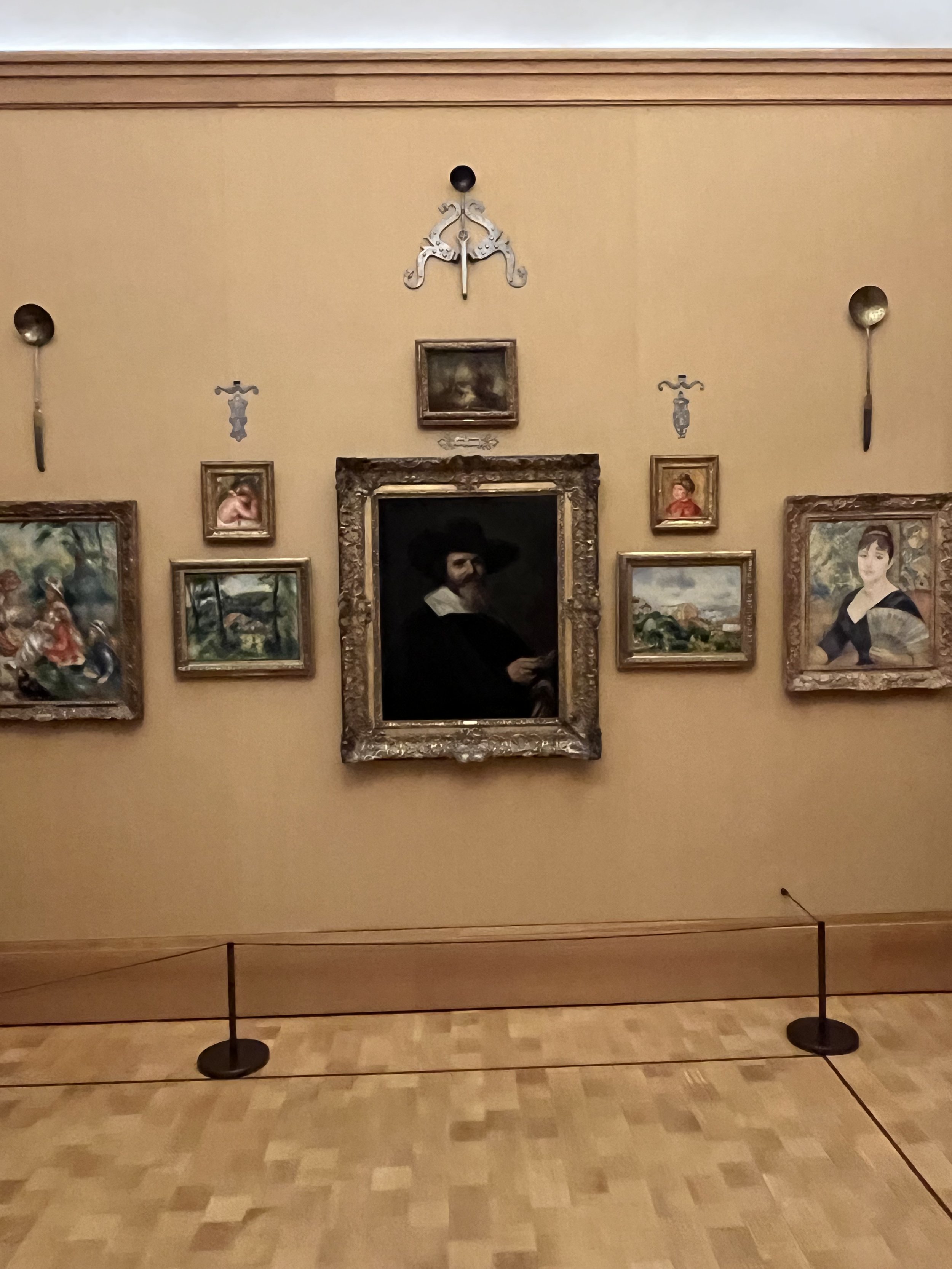
Today, the entire, original 1951 Barnes collection is on view in 40 rooms that are the same size and shape as the original, now in a modern, geometric, award-winning 2021 building in Philadelphia. The Barnes staff installed the art on the walls in the arrangement identical to the original, conforming to Dr. Barnes’s wishes. It is a stunning experience.
The brochure describing the collection notes that Dr. Barnes wanted the collection installed according to line, form, and color. That is the key to understanding how this collection appears. A symmetrical arrangement repeats in all the rooms. The installation’s form and not the objects are the controlling rule. The objects (from paintings to tools and decorative objects) appear according to size, shape, color, and line. In short, modernist principles of visual organization. These modernist principles arose when abstraction was born. Artists and critics needed a vocabulary to talk about the new content and that gave rise to formalist language to talk about art, any art, regardless of the subject, artistic style, or historic period.
What distinguishes the Barnes collection is the exquisite visual sensitivity of the installation. Barnes did not follow the customary installation criteria where curators install works according to artistic styles, historical periods, subject matters, artists, isms, themes, or collections. Nor did Barnes select the 19th century, old-fashioned salon style nor the contemporary center line, for his installation.
Instead, Barnes positioned a large central object, usually a painting in the center of the wall and then flanked the painting on the left and right with smaller examples. Each of these were similar in size and shape. They might also share color, line, subject, or even the artist’s hand. Next to these are another pair. The installations follow this symmetrical rule throughout, from top to bottom and left to right. The Barnes’s collection installations are nothing if not symmetrical.
The first time I saw the collection I was not aware of this organizing principle at work. To see it, I needed to look at the whole (the Ground) and not just the parts (the paintings). I was looking at the “what” and not the “where.” I missed it then. It is crystal clear now. I have written a book about this way of Ground-directed looking.
See STUDIO SEEING: A Practical Guide to Drawing, Painting, and Perception.
https://michaeltorlenauthor.com


